An Exceptional Portfolio Website Project


Table of contents
As web developers, we often have to work in a way that doesn’t challenge our individual skills; when it does, we can’t always take credit. Sometimes, we were just one little cog in a large project. Side projects done in our spare time often lack the resources and priority to reach their goal. So let me show you an exceptional portfolio project that has taken its time because it has been everything but just another project to me.
This article was first posted on DEV as An exceptional portfolio project: https://dev.to/ingosteinke/a-beautiful-portfolio-website-for-a-sustainable-fashion-consultant-3807 by Ingo Steinke.
Exceptional Portfolio Projects
Several years ago, I made a single-page website for my wife’s side job, which would later become her full-time fashion consulting startup. While the old website was just a small side project, I still like it seven years later. But I wouldn’t use the same code base and tool stack for a new project now, and several requirements made me choose my most dreaded and beloved content management system as a technical base to ensure she can add and replace almost any content with or without my assistance.
Challenges and Requirements
After an intermediate ad-hoc release that I wouldn’t be proud to share, we set up some challenging requirements and decided to collaborate with other experts for graphics and web design, photography, copywriting and translation, and get feedback from friends and customers for important aspects of the project.
Responsive Parallax Perspective for Variable Content
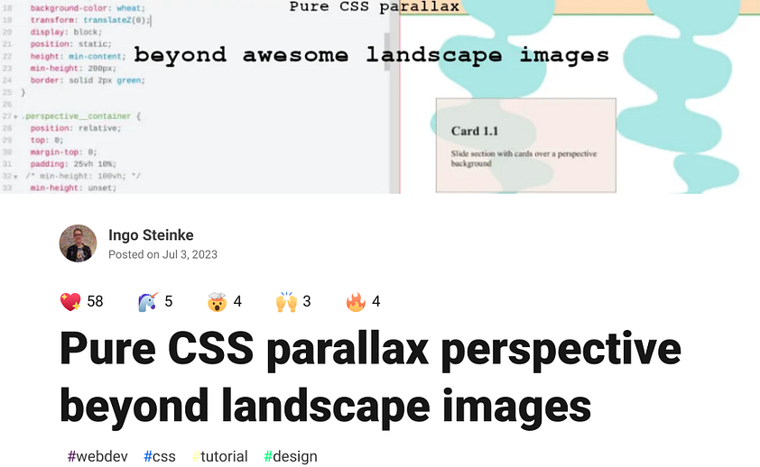
I shared some technological challenges in my blog posts, hoping for more feedback and constructive criticism, including the underestimated quest for a parallax perspective effect that spans most of the responsive page’s height and includes a set of distinct abstract SVG shapes setting the background behind CMS content of unknown variable length and height.
Further reading: Pure CSS parallax perspective beyond landscape images by Ingo Steinke, published Jul 3, 2023 on DEV.
While we had agreed with graphic designer Ina Nixdorf that we should have more than two viewport widths in our Figma templates, nobody had expected that we might have to talk about different heights when introducing a parallax effect, but that turned out to be one of the project’s unknown unknowns.
Finally, how can users enjoy the perspective decoration and sufficient text contrast and readability? Andy suggested partial transparency while scrolling, gradually consolidating into an opaque background after motion has stopped. Another seemingly simple idea that made me question my assumptions and naive first approaches.
Pastel Colors with Sufficient Readability Contrast
I was positively surprised about several other aspects that are known to be challenging in many other web project but just passed any test and review smoothly, like the design system is beautiful, playful and soft, including pastel colors and moving shapes, and it complies to every accessibility requirement including sufficient color contrast to improve readability.
I was lucky not having to work around false positive contrast warnings in accessibility audits despite alternative high contrast schemes. But if you do, here is some research that I did last year.
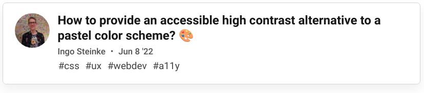
Further reading: How to provide an accessible high contrast alternative to a pastel color scheme? by Ingo Steinke, published June 8, 2022 on DEV.
Animated Key Visual with Vector Graphics and a Photograph
The intro animation was another feature that required some additional fine tuning. The designer gave me a ready-to-use lottie animation package, which saved us extra work and potential misunderstandings. The animation is mostly based on SVG graphics, but there was one PNG image included in a way that I couldn’t simply change to an image source set due to Lottie player limitations. Instead, I wrote a short script, keyvisual.php, that tests the client browser capabilities to send the smaller .webp or the traditional .png fallback. All I had to do is change Lottie's data.json so that it requests keyvisual.php instead of img_0.png.
This saves 619.5 KB of data in modern browsers without any loss of visual quality.
Lottie player is a helpful module in modern browsers, but it doesn’t handle backward compatibility and reduced motion preferences out of the box. I had to add several checks to make sure that the motionless fallback got displayed correctly when necessary. I also added a mouse trap element to start and stop the animation based on user behavior.
Implementing Questionable Features
Some kind of extras spark joy in the hearts of designers and users, while developers are hesitant to implement for various reasons. We don’t have a hero slider with auto-play videos, but there is a kind of carousel for the testimonials, there is a social media feed, and the top navigation shows the active anchor link that we scrolled to.
Waypoint Navigation, Testimonial Carousel, Instagram Feed
There are plenty of ready-made libraries and plugins for that sort of extras, but most do it wrong in one way or another. So if you need a minimal, quick and visually appealing implementation that is accessible, works cross-browser and complies to privacy legislation, you might have to code your own, which isn’t that hard after all. Or maybe it is.
Some challenges and solutions:
Carousel slides should have a
tabindexto facilitate keyboard navigation.Instagram is nothing that you want to deal with directly. Use a third party service that connects to their API!
IntersectionObservermight not have an elegant API, but it is very useful. I used it for the waypoint effect and for lazy loading the whole Instagram section and triggering its opt-in activation.
Further reading: Movement and Visibility Detection with CSS and JS 👀
Quite a lot of JavaScript code for things that should better be written in a descriptive way, if CSS would support it. But that’s just my opinion.
No TypeScript, but JSDoc and Pragmatic Linting
You might wonder why I didn’t use TypeScript. Well, I am an old-school developer and I mostly try to use as little JS as possible and rely on CSS and markup instead, and when I do, I prefer the classic ES3 style without using Babel.
At least that’s where I came from. Looking at my actual code, I did use import, export and some arrow functions, but most of my code is quite classic and so my .eslintrc looks like this:
{
  "plugins": [
    "es5"
  ],
  "ignorePatterns": [
    ".postcss.config.js",
    "node_modules/**/*.js",
    "**/lottie-player.js"
  ],
  "parserOptions": {
    "ecmaVersion": 6,
    "ecmaFeatures": "impliedStrict",
    "sourceType": "module"
  }
}
I found JSDoc is a useful but minimal extension to my IDE’s tooling that already detects and auto-completes the official DOM API very well.
Anything else can be annotated in an unobtrusive way like this:
var targetElement = /** @type {HTMLElement} */ intersectingEntry.target;
Apart from handling HTML DOM APIs in JavaScript, working with WordPress beyond block themes and page builders also means that we have to write some custom PHP code to enhance and configure our themes and data structure.
Turning Users into Webmasters
Empowering website owners to control their own content has always been one of the most important reasons to use WordPress. But with power comes responsibility, and we don’t want to give our customers the freedom to destroy their site accidentally.
Custom Fields and a Custom Dashboard Widget
Custom fields and post types to the rescue! I defined some new post types and some more custom fields to allow editing frontpage content without breaking the designed layout. I restricted most custom fields to either single line text fields or classic editor blocks with limited WYSIWYG functionality like bold text and web links.
But how can we still give the user an idea about what it will look like when it’s published? One thing we can do is add admin editor styles to set the correct colors and typography in the text field.
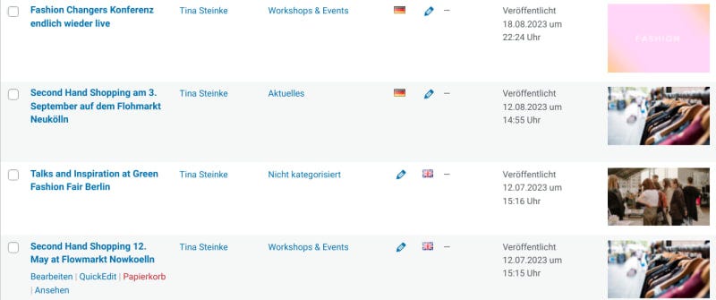
I also added a custom dashboard widget with mobile friendly touch buttons in front of a partial screenshot so that we don’t have to remember that “News” are actually “posts” or even “Beiträge” if we switch to the German admin interface.
Thanks to custom post types, the website content consists of structured data and we are ready to extend our one-page portfolio using archives, categories, and single detail view pages to present additional details in a way that benefits search engine optimization.
But I nearly forgot about another important requirement:
Localization and Customization
We want to provide the content in German and English and we want a top navigation with a language switch that links to the appropriate alternative page but also works well with the anchor links on the frontpage. I decided to use Polylang’s default language switcher except for the frontpage, where I added some custom logic in PHP and (as a progressive enhancement) in JavaScript: keepAnchorTargetInLanguageSwitcher.js.
Another unknown unknown was the fact that our alternative languages made any list view even more confusing due to the fact that Germans like to use many English words and you might get the impression that your site is full of duplicate content.
A more Visual Admin Experience
I found a useful plugin, Display Featured Image In Post List, that adds post thumbnails to the lists, reducing mental load by allowing a more visual approach to content editing.
Last but not least, there are some auxiliary pages like imprint, terms of service, and privacy statements in every language, and we might possibly want to add landing pages for special events or offers in the future.
Block Editor Support for Additional Pages
This is where the new block editor becomes useful! We don’t have special visual design for our legal pages, but we might give translators or legal experts author accounts to make them edit only one specific page where they can copy and paste rich text from word processors or existing PDF documents. Enabling our theme to support block editing on any other page except for the frontpage, while still using custom fields and post types with a restricted classic editor doesn’t make our theme a “hybrid” WordPress theme (as it still doesn’t use the new theme engine) but a pragmatic extended classic theme that I described in greater detail in my WordPress post series:
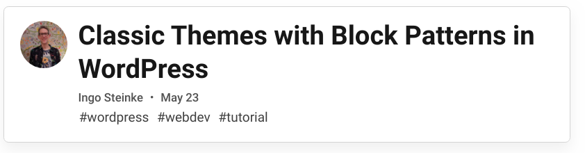
Futher reading: Classic Themes with Block Patterns in WordPress by Ingo Steinke, published May 23, 2023 on DEV.
I could go on an add verbose paragraphs about our project, but I didn’t use the tag #showdev for no reason. Everything is open source, free to view and get inspired, free to attract comments and critical feedback as well.
Open Source Code Base
Here is the code base: github.com/openmindculture/kleiderordnung-berlin including an extensive README file, an additional German site owner’s manual, and several tags and issues where you can study my challenges and solutions in greater detail, if you like.
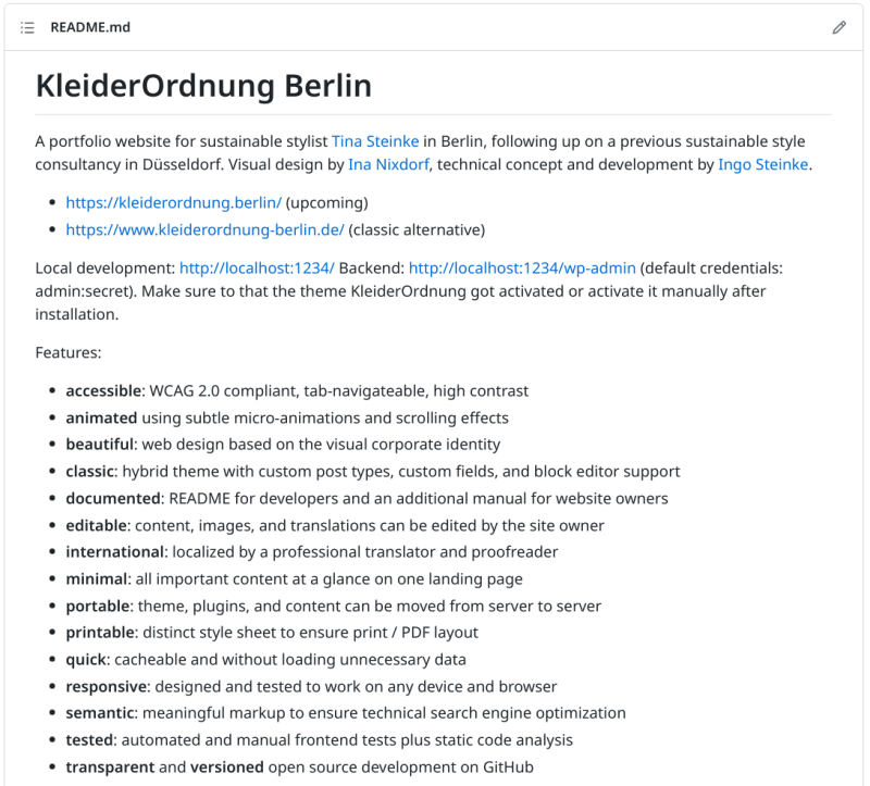
The README states and explains how the website is accessible, animated, beautiful, classic, documented, editable, international, minimal, portable, printable, quick, responsive, semantic, tested, transparent and versioned.
The build process is based on one of my own opinionated WordPress development template repositories using PostCSS, esbuild not much more. The localhost server is controlled by Docker, and everything can be tested using codecept and jasmine.
Apart from the theme, there are three must-use plugins to persist custom post and field data, and the custom dashboard widget, even when the theme is not active, and a plugin to allow overwriting existing content when using the official WordPress import tool.
Regular third-party plugins include Akismet, Contact Form 7, and Flamingo to provide a contact form without getting too many spam messages, TinyPNG and W3 Total Cache for load time optimization, and Polylang for localization.
Domain names and search engine optimization
We had lengthy debates with marketing and SEO experts about the domain name which is based on a German word play that probably won’t be understood by every German customer. We don’t own the more expectable .de domain version, and we finally decided to prepend the optional www. at least on printed material to avoid confusion about the unusual local .berlin top level domain. In the end, there are multiple variations that all lead to the same canonical short URL and even if you don't know that "Kleiderordnung" means "dress code" but it also translates to "clothes" + "order" = helping to organize your wardrobe in a more efficient and inspiring fashion, it doesn't matter, as the wardrobe assistance is just one of several different services that Tina has to offer.
Going live!
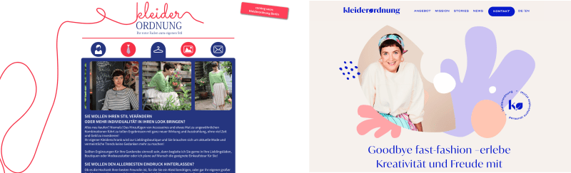
Finally, here is the actual website: www.kleiderordnung.berlin

“Say goodbye to fast fashion — and say hello to the creativity and joy of creative, stylish, sustainable wear!”